UNDRDAWG ATHLETICS
Brand identity, dynamic logo system, and creative direction as lead designer, shaping marketing strategy and premier athlete collaborations.

Explore Full Gallery
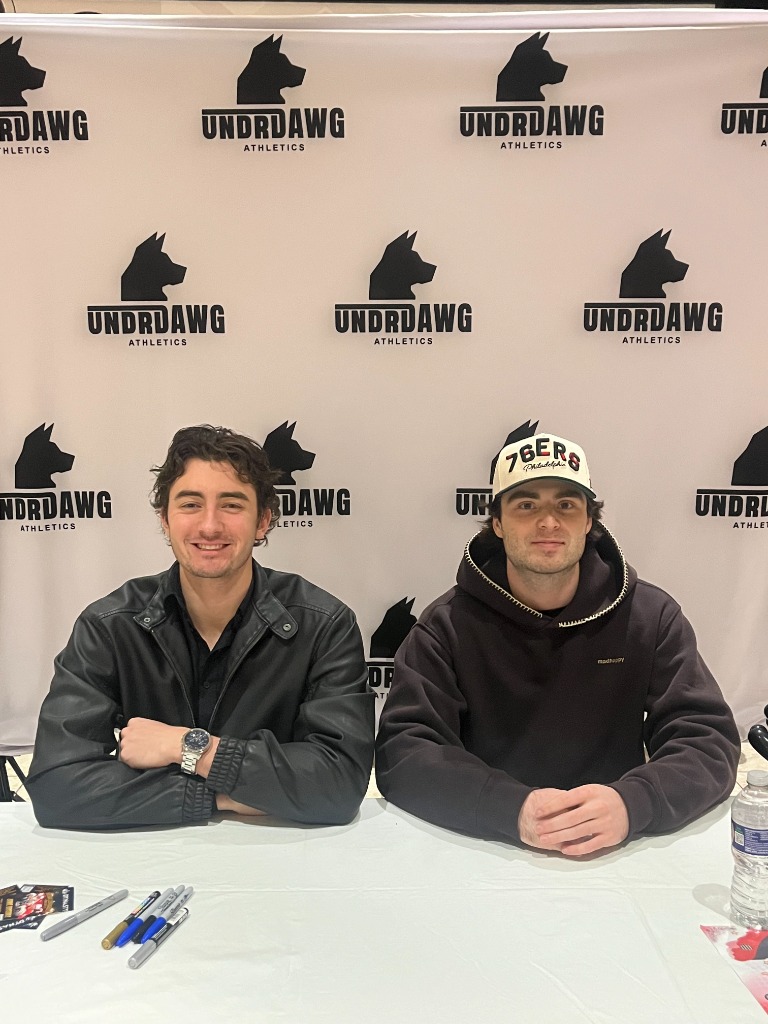
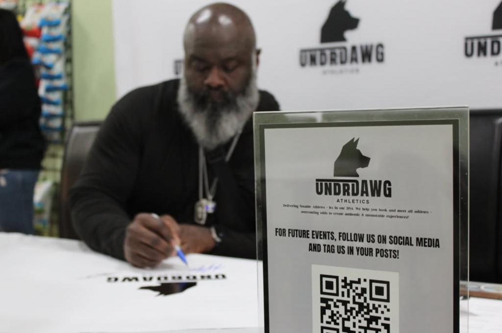
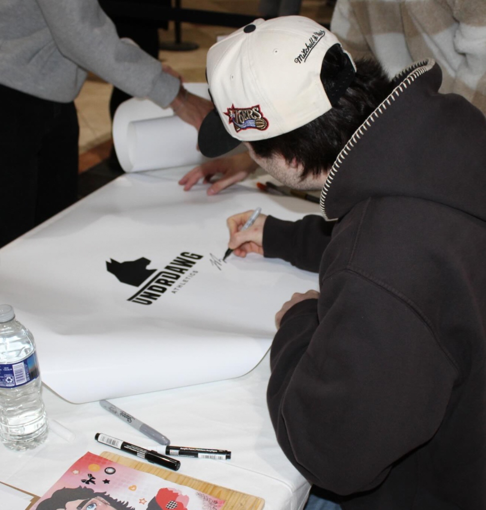
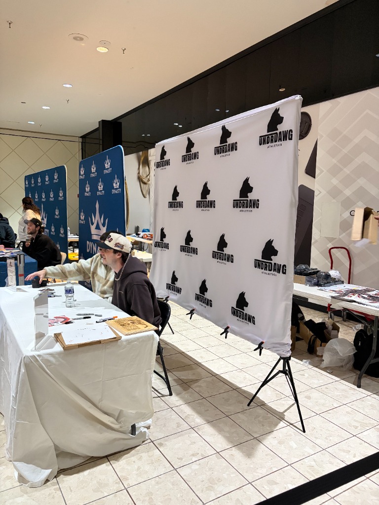
Undrdawg Athletics is a sports agency and athletic lifestyle brand started by friends at Drexel, built around athlete signings, meet and greets, and memorabilia in the Philadelphia area. I was brought on early for my eye for design and helped shape the brand from the ground up....

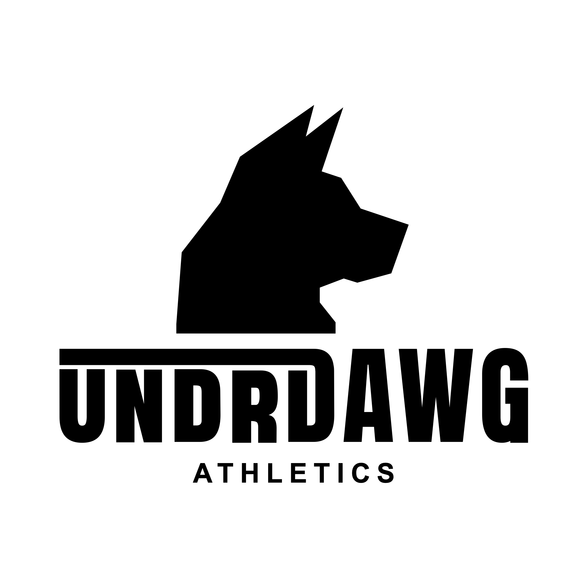
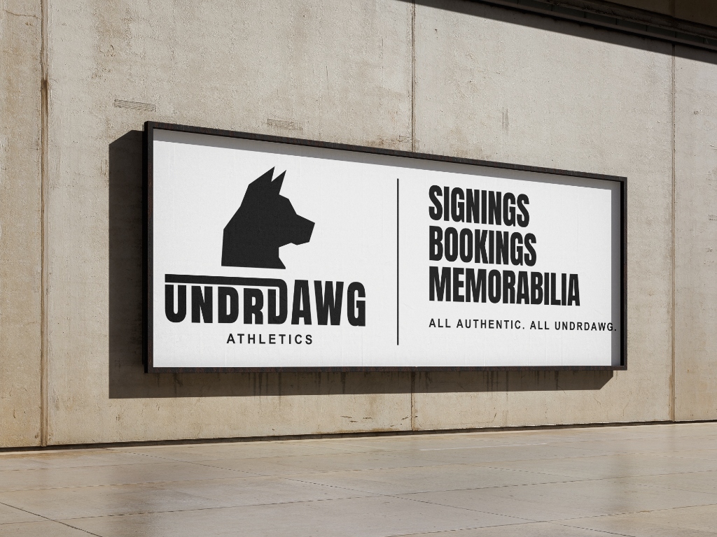
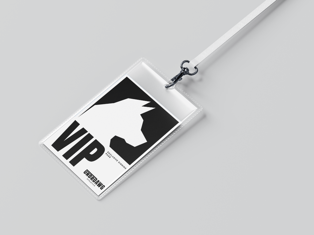
The logomark translates the tenacity of the athletic underdog into a sharp geometric canine silhouette. Precision angled facets evoke speed, tactical discipline, and unrelenting forward momentum across digital screens and competition apparel.

The wordmark was designed with the name itself in mind, letting the athletic grit of Undrdawg come through in the typographic hierarchy. Scaling UNDR smaller and tucking it under the horizontal bar while DAWG stacks boldly over symbolizes the creative play of the typemark, turning the underdog dynamic into an assertive visual statement.
Guidelines

The Mark

Pure Geometry
All straight lines, no curves. The geometry is the point.
Directional Form
Faces right, reads as movement. Holds from an app icon to a banner.
Scalability
Built to work at any scale.
Primary Mark

Type Mark
The wordmark uses a condensed, heavy typeface chosen to match the weight and attitude of the emblem. The name Undrdawg has its own weight to it.
Color
The identity runs monochromatic.
Logo Exclusion Zones
We have defined an exclusion zone that prevents other graphic elements from interfering with the Undrdawg logo. The boundary is determined by clearance value x on all sides.
 80px
64px
48px (minimum)
What Not to Do
The mark should always appear black or white, unaltered, and at proper scale.